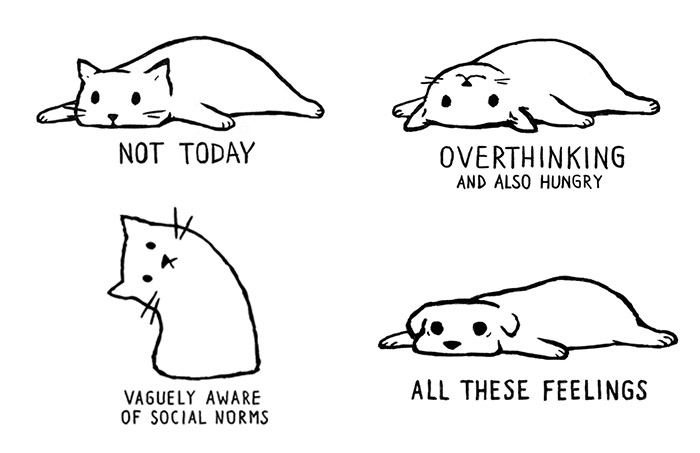
I have a lot of designs and all of them are uploaded to my Artist Shop on Threadless, and sometimes I submit them to Threadless competitions. Every once in a while Threadless selects one of the designs to add to their main store and then they send me a $250 gift code.
What do you need to do to get your own gift code? Follow these steps:
- Upload a lot of designs. And by “a lot” I mean A LOT. At least 30, but aim at 50. The more designs you have, the higher chance that one of them is selected by Threadless. Submit them either to your Artist Shop or to Threadless competitions.
- Wait.
- But don’t do nothing. Keep sending designs.
- One day Threadless will accept one of your designs to include in their main store and they will send you a $250 gift code and you can spend it on whatever you want on Threadless. And you also get royalties for each item sold with your design.
That’s it. That’s all you have to do. Don’t overthink it — just draw something and submit. Repeat.
Good luck!


