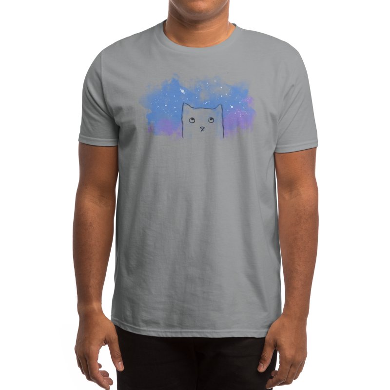
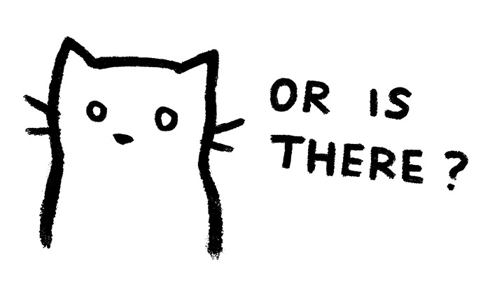
I sorted my designs by how much money they’ve earned me so far.
Some fun facts:
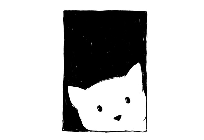
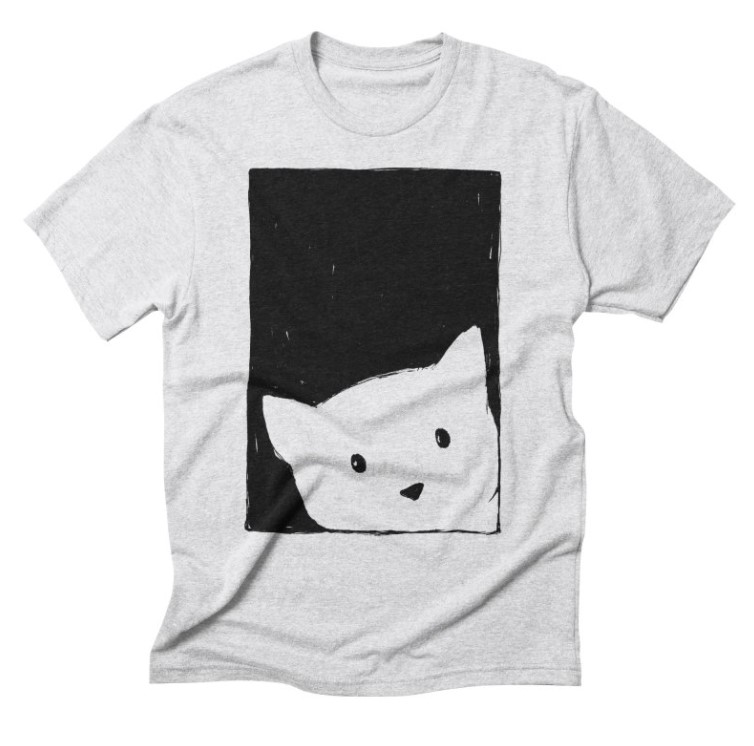
- My top 4 designs have cats!
- 8 out of 10 are black and white designs.
- I hesitated to send 5 of those 10 designs to Threadless and to my store. I thought no one would like them. And yet, here they are, in the top 10.
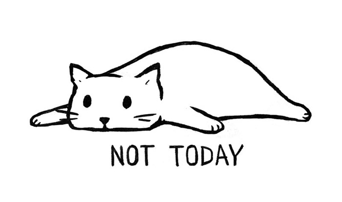
- My most popular design “Not Today” is responsible for half my total income.
1. Not Today
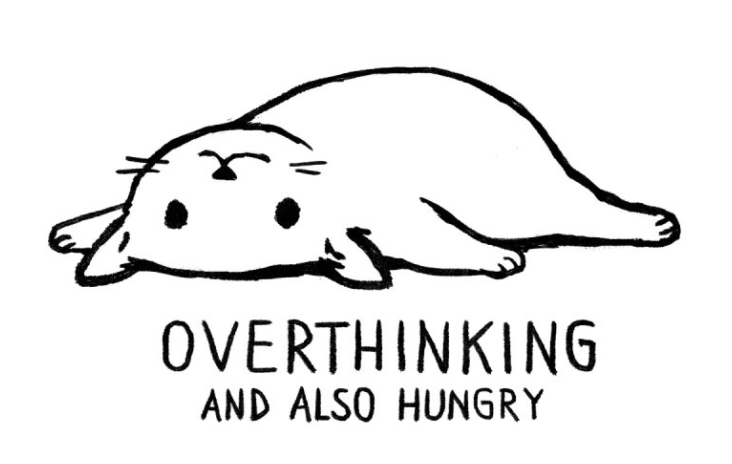
2. Overthinking and Also Hungry
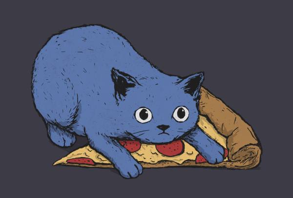
3. Get Your Own Pizza, Human!
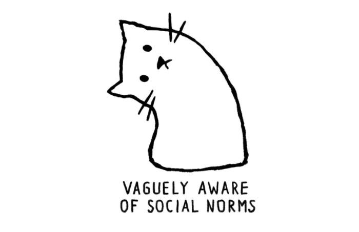
4. Vaguely Aware of Social Norms
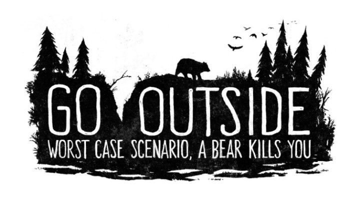
5. Go Outside. Worst Case Scenario, A Bear Kills You
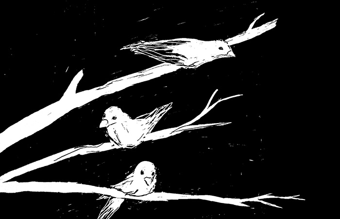
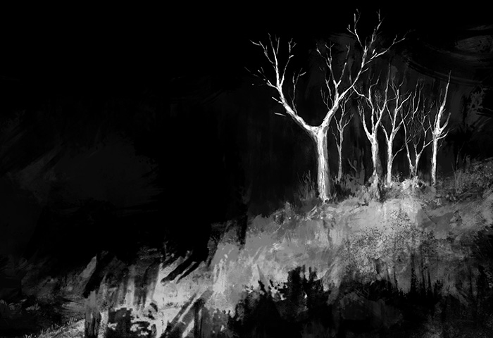
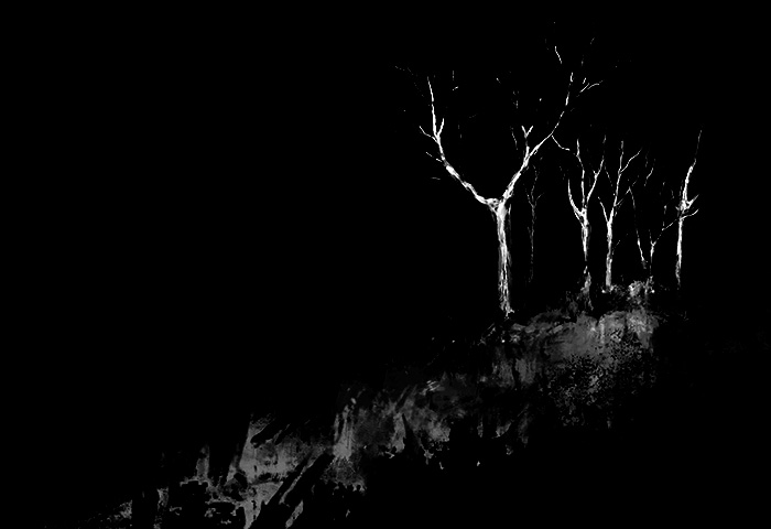
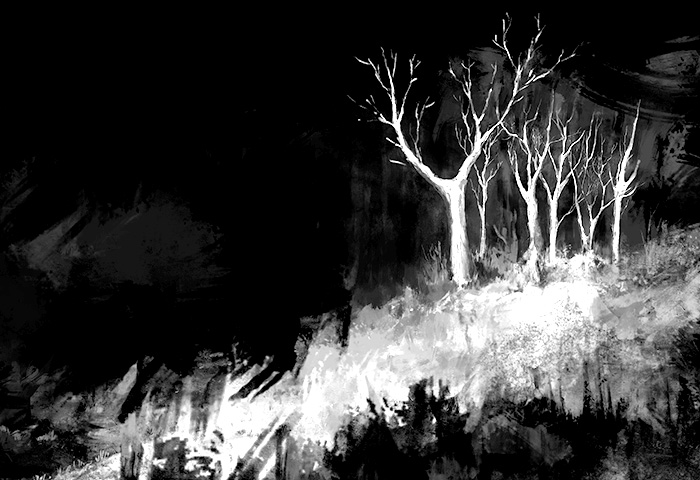
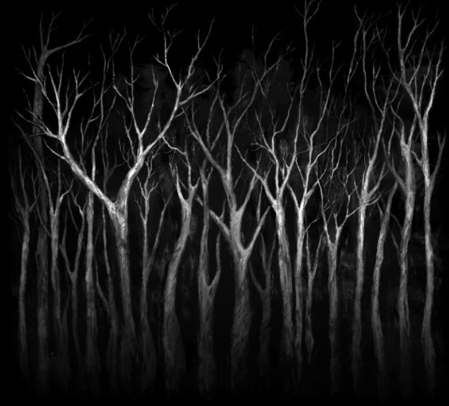
6. Among Trees
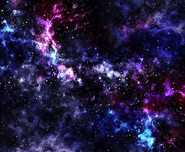
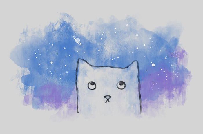
7. Space Stuff
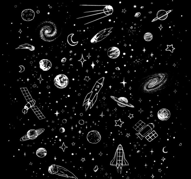
8. Space Botanica
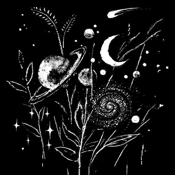
9. Adequate Expression of Feelings
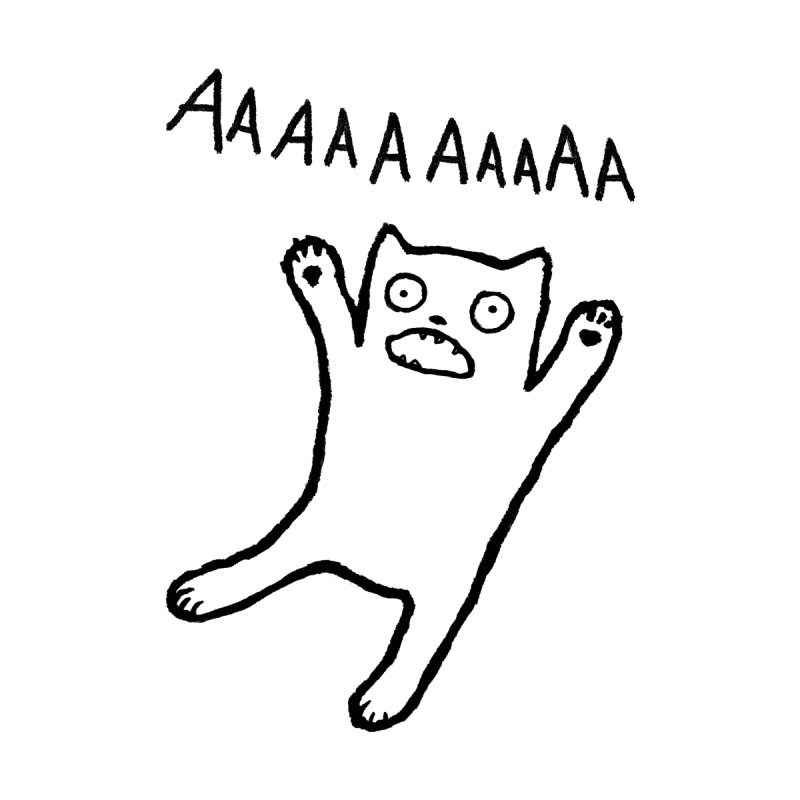
10. Inconceivably Vast
