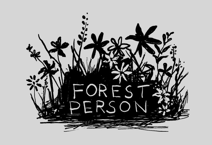
A few days ago I shared my Forest Person design:

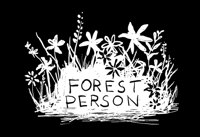
This is a black design on a grey background. But not everyone likes wearing light t-shirts. So I always try to invert colors and upload the design again, this time as a white design on a black background. However, when I inverted the colors, the design didn’t look so good:

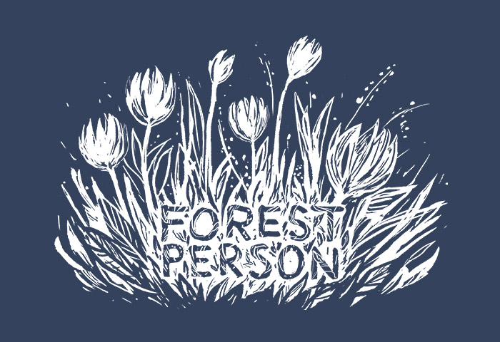
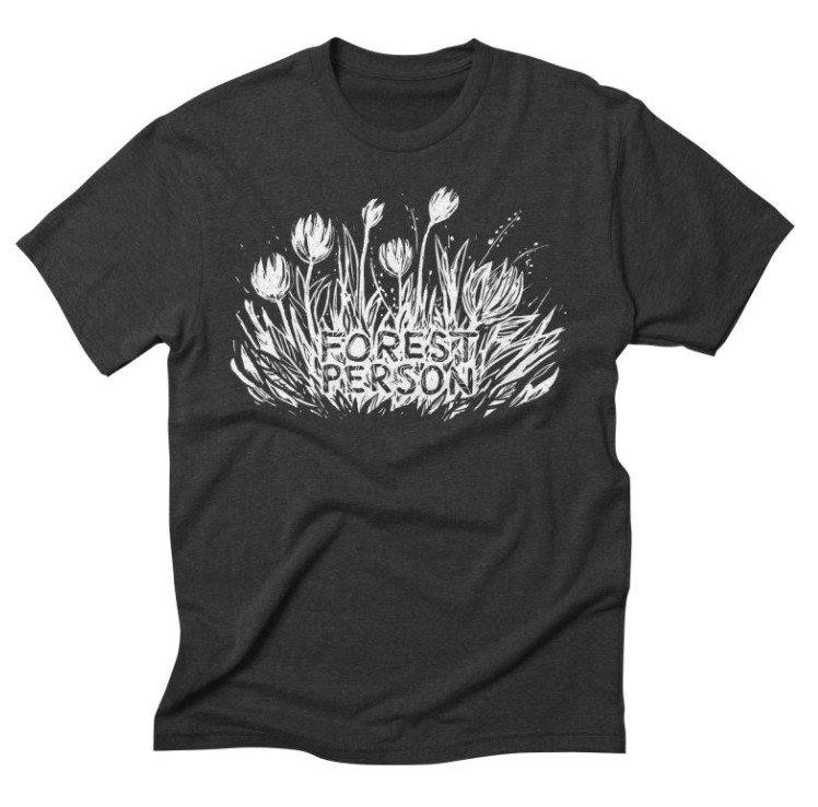
It sort of looks like a white blob. I decided to paint the design again so it would look better on darker colors. Here’s the new version:


This design was made with reMarkable 2, which I love.