I was reading Seth Godin’s blog archive at random and came upon a post titled “Judging a book by its cover”. Here’s a quote:
You can always tell the jacket designer is in trouble when the cover uses irrelevant type design to get the project over with.
As an example he used George Orwell’s “1984” book cover:

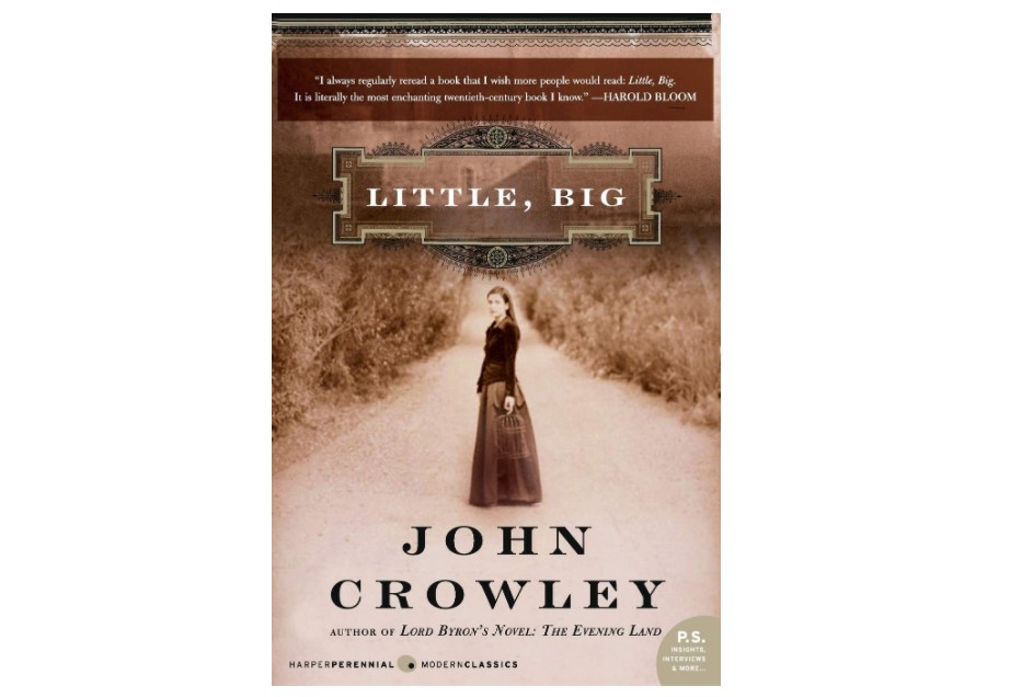
That reminded me of my favorite book, “Little, Big” by John Crowley. The paperback cover is this:

But the cover for the Kindle edition is just a typography design, and it’s even worse than the cover of “1984”.

That’s the lowest effort cover that I have seen.
It could have been a popular book but the publisher just keeps shooting themself in the foot with those covers.